Looking for a way to make your next project pop? Use color paper. Take a look at these tips for designing and printing on color paper.
When it comes to print, nothing grabs a person’s attention like color. This is partly because the brain notices color before words or shapes. As a result, color often can be the sole reason someone chooses to purchase a specific product.
With print projects, the impact of color is undeniable. Research has found that the use of color:
- improves readership as much as 40 percent.
- enhances comprehension by 73 percent.
- increases retention by 18 percent.
Clearly, color is an important consideration for any print project. But color isn’t limited to ink blends, logos and photographs. It also can include the paper on which the project is printed.
“Using color paper is a great way to make a piece more interesting,” says Meredith Collins, Domtar brand marketing manager. “For example, used as an accent piece in an annual report, a booklet or a brochure, it’s a great way to call out information and keep your audience engaged.”
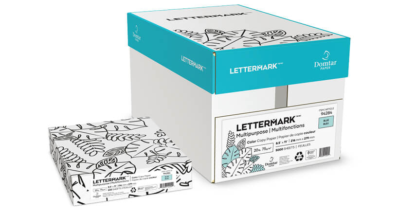
Domtar’s Lettermark® Colors line gives designers high-quality, environmentally responsible papers to incorporate into any project. With 12 Colors, there are plenty of eye-popping shades from which to choose. And if you’re looking for more subtle color, Cougar® Natural is a great options
Three Considerations for Designing with Color Paper
- The Ink — CMYK inks are transparent, not opaque. This means that the color of the paper will show through the printed design. For example, an image with a green base will appear greener when printed on green paper. Even cream-colored papers can affect the images, making the design look warmer thanks to the yellow undertones of the paper. This effect could even be desirable, as you can use the color of paper to influence and enhance your design.
- The Highlights — With projects printed on white paper, the paper’s color is used to create highlights. The same effect happens with color paper; therefore, use the same color as the stock to create the highlights of the design. If you need to create the impression of white in the design, you can do it without having to resort to a spot color. Instead, try using a very pale color, such as light yellow or light blue. It won’t be white, but it can mimic the effect on color paper.
- The Computer — While you can’t rely on your computer monitor to accurately depict the printed color of a design, you can use it as a tool to help understand the way the color will affect your images. Create layers in your document, with a base layer the same color as the stock you will use, and the design layers on top so you can see how the finished project might look. Remove the base layer prior to printing.
A Better Final Product
As always, communication with the printer is important for making sure the finished job looks the way you expect it to look. When working with color paper, ask for a printed sample on the stock you have chosen, so you have an idea of what the color actually looks like and how the stock accepts ink.
You can always request a press proof of your own project, although this might be a more expensive choice. Another option is to ask for a digital proof, which may be easier for the printer to provide, even if your project is meant for offset printing. You can simulate the color of the paper in the art file and run a digital proof to get a reasonable idea of the final outcome; just keep in mind that it won’t be an exact representation of the end result.
Contact us if you have questions about using color paper.