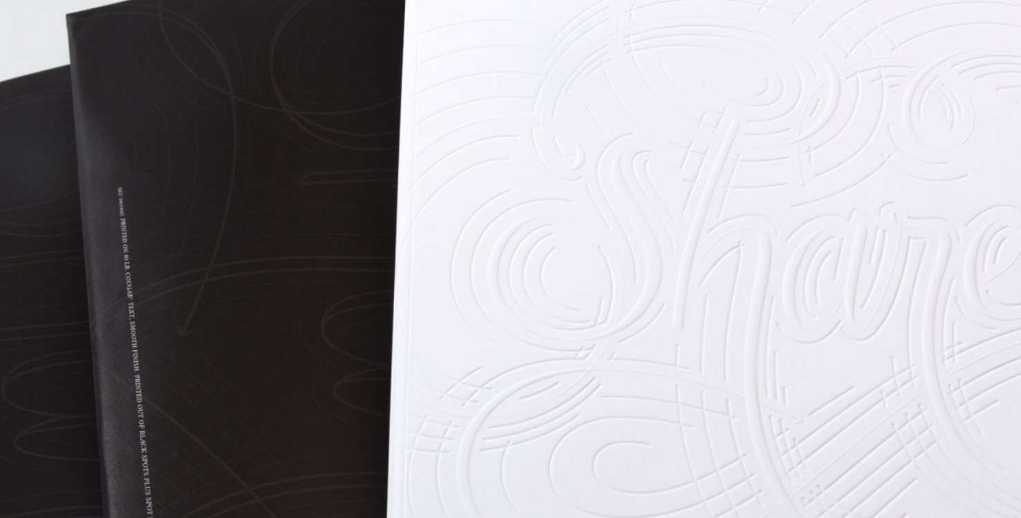
Debossing and embossing provide an additional dimension to offset commercial printing—literally—because they add depth to what otherwise is a flat piece of paper. This alone can give your design piece a more tactile quality, and a stimulating visual. Depending on the finished piece, it can be readily apparent that a piece has been embossed, but can you tell the difference between embossing styles? Let’s use an example: what’s the difference between this emboss?
 And this emboss?

If you don’t know, don’t worry (we know it’s hard to tell on a screen) I’ll break both techniques down using our beautiful Share on Cougar promotion. And if you’re a print veteran who has countless embosses under your belt, don’t leave just yet—I have a few resources that might just be a help to you as well.
EMBOSS YOUR LIFE
Featuring a variety of beautiful gallery samples that can be viewed on Paper.Domtar.Com, Share on Cougar is known for its elegant blind emboss on the front cover. The cover features a multi-level emboss, meaning it has both deep impressions and highly-raised areas; put more simply, it’s an emboss and a deboss at the same time. We used the same dye and the same amount of pressure to create this poster that’s perforated out in the back. You can see here the impression it creates.
EMBOSSING TECHNIQUES WITH VARYING INK COVERAGE
With the high ink coverage, this piece is covered with an intense rich black, and as a result, you almost don’t notice the emboss until you pick it up and then surprise! By combining different print techniques with varying ink coverage, you can create new effects that catch and hold your audience’s attention. The impact you want your design to have is important to consider if you choose to invest in a post-press technique like an emboss. If you want an element to “pop” or have dimensional variation, perhaps you should use less ink coverage. However, if you want to create an element of surprise that interacts with it, maybe you should have more ink coverage. This is an important consideration and you can learn more about it in our complimentary Embossing Guide, available at www.paper.Domtar.com.
ADDING LUXURY TO EMOTIONS TO YOUR DESIGN
A beautiful cover design that looks and feels luxurious establishes a black-tie style that continues throughout your artwork. The word “Share” was meticulously hand-lettered and sculpted using a multi-level emboss, which provides an ideal showcasing of how well the paper letterpresses. The narrative explores the concept of sharing and how it connects people using warm photography and friendly copywriting. About midway through the book, it becomes a gallery featuring creative work submitted to Domtar’s Blueline blog and was printed on Cougar® paper. We wanted our gallery to provide a first class feeling of elegance and to highlight the unique aspects of each piece.
Finally, the inserts within the brochure encourage the audience to “share” with others. A series of postcards are perforated and inserted into the back of the book along with a mini-poster that can be kept and displayed. The poster repurposes the hand-lettered type, but this time, it uses a multi-color approach that is strikingly beautiful.
THINGS TO CONSIDER BEFORE EMBOSSING
Embossing can enhance a project. However, before you jump to make an impression, there are a few things to consider:
- Blind embossing costs less than registered embossing. First, you’re only paying for one process. Secondly, the custom printing vendor does not need to ensure precise positioning (i.e., tight register) with blind embossing.
- Thin types, serifs, and thin rules don’t do as well when embossed. Make sure the image area (drawing, type letterform, or rule) is wide enough for the paper to be forced into the die set. Discuss this with your printer to ensure success.
- Deep embossing dies have beveled edges (and are often called “sculpted” dies). These beveled edges will reduce the apparent width or thickness of rules and letterforms. Therefore, make your art just slightly wider/thicker than normal to account for this effect. For safety, discuss this with your printer.
- Dies are not made by the printer. They are made by specialists. In addition to being expensive, this subcontracted work takes time. Make sure your printer has accounted for this extra time in constructing your overall custom printing schedule.
SELECTING THE BEST PAPER FOR EMBOSSING
Like many printing techniques, embossing is better suited for certain papers. Used as a design element, embossing can provide differentiation of a brand or product. An embossed design is a highly effective technique for retail, beckoning the consumer to physically touch the packaging. Turns out it is in this act of holding a package that our brains make the leap to perceived ownership and increases the likelihood of making a sale.
Personally, I think the best results I have gotten were from using an uncoated stock in a moderate cover weight. Your printer can help you choose a good stock. A soft, thick paper is ideal for embossing and debossing. The warm and tactile feel of the uncoated paper compliments the richness of embossing, producing an eye-catching final touch. It may be tempting to try another uncoated paper that claims to be just as good, but nothing runs quite like Cougar paper. With a smooth, uniform surface and excellent formation, you can count on Cougar paper to help keep projects on schedule with excellent performance every time.
For more on embossing, download our complimentary Embossing Guide or, check out the rest of our blog.


