Cougar® Paper Trails is the next generation of Paper 101 education, pairing inspiring insights with tactile, arresting visuals. Our celebration of the award-winning series continues as we pull the curtain back from the print techniques that make up Volume 2: Get the Feeling Right. Let’s take the plunge.
UV Come to the Right Place

This effect is created by applying a spot UV gloss.
We added a spot UV gloss palm tree pattern on the spread shown above. Contrary to popular belief, you can add a spot UV to an uncoated paper by utilizing an offline screen coater. Spot UV can be used to apply an interesting pattern to plain paper or printed images to increase visual interest. And thanks to its unique feel, it also adds appeal using the sense of touch. When using a spot UV, you need to make sure the imagery you choose enhances the design, not detract from it. UV gloss is shiny and reflective—so make sure the image is not too large or doesn’t compete with what’s underneath it.
Grits and Glam
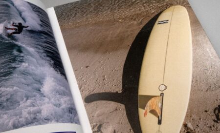
Offline screenprint of grit UV is added to the sand around the surfboard and water to produce a tactile experience.
Unlike one-dimensional digital ads or emails, printed marketing materials connect with multiple senses. You can see vividly printed pieces, but you can also touch, feel, and even smell them. We’ve covered the haptics in the past, but Paper Trails elevates it to a new level.
On the spread pictured to the left, we added a grit UV to the sand around the surfboard and water. The result is a page that looks and feels like the beach, adding a unique tactile experience and transporting customers directly to the shoreline. Textured grit UV brings depth, contrast, and tangibility to a printed piece and we’re seeing this technique used more and more in direct mail pieces like travel brochures or airline promotions.
Orange You Impressed?
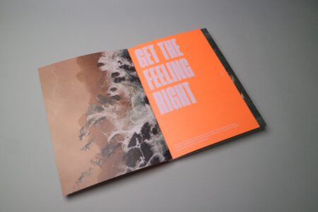
You might want to grab your shades for the opening spread. The front panel was printed on 80 lb. Cougar Smooth Cover, with two hits of orange 811 plus a flood of aqueous coating. The result is a dazzling fluorescent shade that stops readers in their tracks. Bright bold colors are having their moment, so don’t be afraid to use them in your designs – color can increase brand awareness and recognition by 80%!
Color Makes Waves
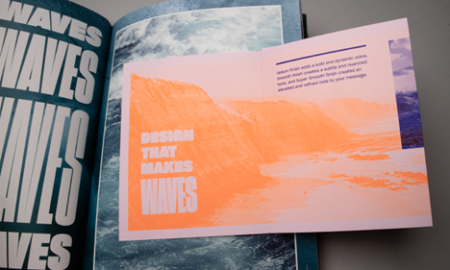
While all print techniques carry the potential to elevate your next printed piece, there is beauty in simplicity. We printed the spread below on 80 lb. Cougar Vellum Text as a tritone using a magenta screen for the background and a match orange and match blue for the text and imagery. Converting your images to one or two spot colors instead of using a traditional four-color image is a simple way to capture attention and make images more appealing.
Sea for Yourself
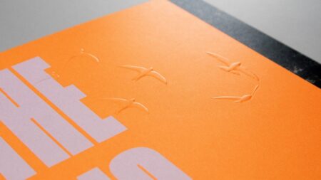
As mentioned before, Get the Feeling Right employs a surfing motif so it was crucial that every element enhance the theme. When you hold your copy of Paper Trails just right, you can catch some sun (from the fluorescent orange opening page), and you can nearly hear the birds flying overhead courtesy of a blind emboss. This emboss raises the image from the page and helps the birds take flight.
Download our Cheat Sheet for an easy-use guide towards achieving these effects. To see these techniques for yourself, visit our website and request your copy of Paper Trails Volume 2.


