Most seasoned print designers are familiar with the term “rich black”. For those of you who aren’t, I will try to make sense of how and when to use rich black. Rich black, or built black as it is sometimes referred to, is an ink formula that is built from all the CMYK (Cyan, Magenta, Yellow, Black) printing ink colors. The values chosen for each color will vary depending on the designer or printer you ask, but the purpose for rich black in a printed piece remains the same; the desire for a deep contrasting black that stands out. Finding your preferred CMYK build may take some trial and error.
Why Rich Black?
This may have happened to you…Your latest printed design comes hot off the press and finally get a copy in your hands and disappointment sets in. You were expecting impactful dark blacks in your printed piece, and you got muddy dark grays. What happened, you may ask. The simple answer is that the black in your art was set to print with 100% black C0/M0/Y0/K100, also called key black. The paper absorbed some of the ink and dulled back the black resulting in a gray appearance. Not to worry. How and when to use rich black can turn an ordinary printed piece into an exceptional printed piece.
The Paper Choice
If a deep dark black is what you desire, there are a few things to consider before formulating your rich black: What are your printer’s capabilities? What paper do you plan to use? What mood are you going for? Many of your questions will be answered just by speaking with a trusted printer.
Where paper is considered, a coated paper is designed to absorb less ink and will naturally print a darker key black, but using a rich black is still advised to achieve that stand out contrast. Uncoated paper will as you might expect absorb more ink. While true, this in no way should scare you away. Uncoated paper brands like Cougar® and Lynx® from Domtar can achieve a velvety rich black unrivaled by coated sheets. The beauty and feel an uncoated sheet can provide far outweighs any ink absorption concerns.
Depending on the subject and mood of your design, consider your paper shade. With a bright white sheet, you may want to consider a cooler black. If a cream or natural sheet is more to your liking, consider warmer black to best suit your printed piece. Achieving these subtle variations will require working with a knowledgeable printer to find the right ink formula to achieve your desired effect.
Finding Your Formula
There are a few key things to know before building your rich black to avoid potentially costly printing errors and embarrassment.
- Your CMYK ink values should add up to less than 300%.
- Check-in with your printer for the maximum ink coverage for the particular paper your job will be printed on. “Too much ink results in "bronzing,” a bronze sheen created by a layer of ink that can't be absorbed by the substrate, so it just sits on top. It's also almost impossible to dry completely, so you'll add time to the job. This is why you must never use the Registration swatch in a layout. Registration is 100% everything: CMYK plus any spot color plates.” Registration marks are the only place the [Registration] swatch is used, but they are in the slug, not in your artwork.”
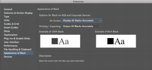
- Don’t trust the black you are seeing on screen will be true to print. Check your design software preference settings. In InDesign and Illustrator make sure your Appearance of Black is set to Display All Blacks Accurately in both On-Screen and Printing/Exporting areas.

Preference window from Adobe Illustrator 2020
In one of our previous blogs, Print Solutions: Achieving a Deep, Rich Black on Uncoated Paper, Technology Manager, Lori Slovik suggests this rich black formula built from C40/M30/Y30/K100 which work exceptionally well on Domtar paper. Other formulas may look like this C60/M60/Y40/K100 or C75/M68/Y67/K90. To find your rich black formula you may need to test out a few. For instance, in our Cougar: Luxury Within Reach promotion, our printer used a double hit of process black to achieve the deep black on the front cover.

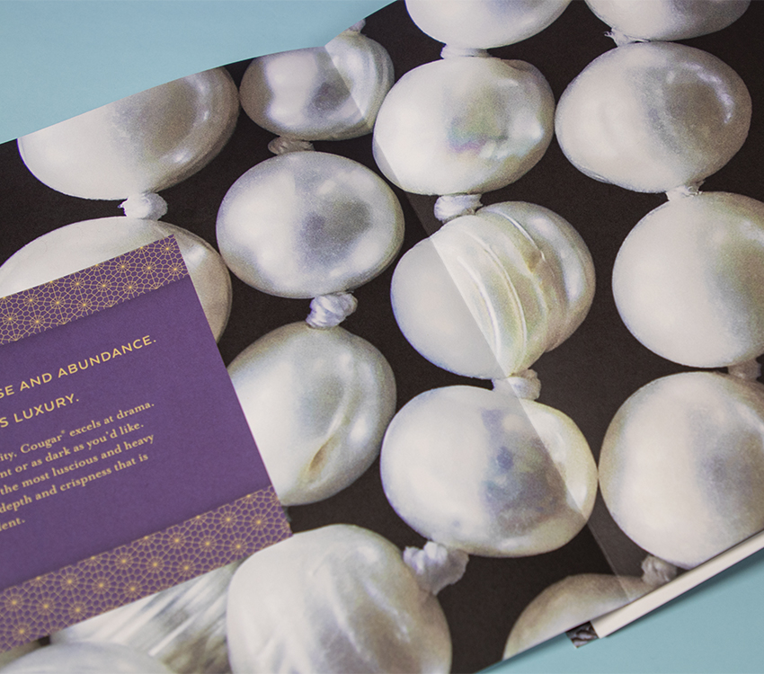
Cougar – Luxury Within Reach promo 2019
With a trusted printer and exceptional paper, you can sometimes push the ink coverage boundaries. For the inside spreads we used a four-color process plus an extra hit of black to achieve these beautiful, deep, velvety blacks. Our printer pushed the ink densities here because they knew that Cougar® and Lynx® could handle it. As you can see the results are striking.

Cougar – Luxury Within Reach promo 2019

Lynx - Beauty & Performance promo 2019
When Not to Use Rich Black
How and when to use rich black is a matter of understanding your paper and your printer’s capabilities. A deep dark black is very eye-catching and makes your piece look professional. Finding the right formula for your next piece will be worth the effort and is sure to impress. If you have the luxury of choosing your paper, print your next rich black design on one of the fine uncoated papers from Domtar. You won’t be disappointed.
Additional Resources
Here’s a couple of good informative videos I found on the subject:
Deep Rich Black vs 100k Black in Adobe Illustrator - What's the difference? - Pixels Ink, 2019
Rich Black vs 100K Black - How to Print Good Black CMYK - Adobe Illustrator CC - Cary Hawkins, July 2017
Check out our Gallery for some exceptional work printed on Domtar Paper. And, please submit your rich black successes with us.


