We’re in the middle of Q1 and all of those deliverables you have circled on your calendar are fast approaching—your event with hundreds of attendees is approaching in Q2 and you need to deliver a booklet that’s commemorative but functional; the magazine you’ve been planning and working on for years finally debuts this summer or maybe you’ve heard about the efficacy of print; you’re finally dipping your toes into printed promos with a big optichannel campaign launching in Q3. No matter the job, you’re finally at the “make a decision on the paper!” to-do on your task list and you’re stumped. There are a variety of options. You’re unfamiliar with the territory and one question is on your mind, “Does the paper quality affect printing?”
In short, yes. All paper is not created equal and that’s a good thing!
Paper quality and print results go hand in hand and with so many printing papers available, it’s hard to know what to look for. Your choice can make all the difference between a dream design and a nightmare rollout—you may believe that the sheet doesn’t mean much but I’m here to tell you, it does.
Below are a few real-life examples of why there is a “right” paper for every job.
Quality on a Budget
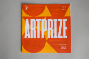
ArtPrize is a world-renowned art contest that turns Grand Rapids, Michigan into a hub for the arts for 18 days. Historically, the event has been attended by hundreds of artists and in 2021, it returned bigger than ever.
A community event for over 10 years, ArtPrize represents art and stories from all over the world and the design elements of this year’s event guide were inspired by the indigenous tradition of making totem poles. Interpolating the indigenous symbolism and homages within their event guide, the centerfold of the piece is a map that can be pulled out for visitors to have in their pockets for easy reference during the event. ArtPrize even provides a QR Code on the printed map for guests to easily connect to the interactive digital map.
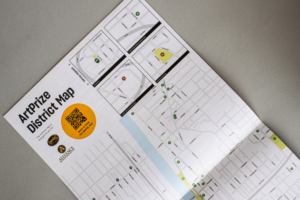
Charged with producing 35,000 copies of the 28-page guide, the minds behind the printing of the guide, Swift Printing, knew that they needed a sheet they could trust. Swift had a certain impression they wanted to make and a standard they wanted to uphold, so they chose the right paper for the job. Ultimately, they selected their go-to sheet, Husky® paper.
Husky strikes the right balance of quality and affordability, so no matter what you’re running you can expect reliable and trouble-free results. Additionally, because it’s made by Domtar, you can feel confident that every sheet is uniform and has excellent formation – meaning fewer surprises and guesswork while on press.
Paper for the People
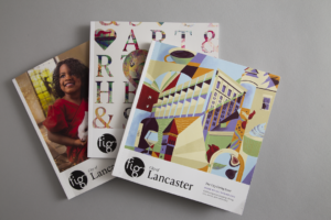
Fig is a local-loving guide for aspiring entrepreneurs, impactful leaders and the many other places and people that make its home, the City of Lancaster, Pennsylvania, so unique—but it’s also much more.
Fig is their first impression of those communities.

Whereas ArtPrize needed to budget for a large audience, Fig is all about the experience of reading their magazine. They still required a paper option that wouldn’t break their budget but it also had to worke for a variety of images and articles without sacrificing the final outcome. Printed conventionally on Lynx® paper by The Standard Group, Fig ultimately chose Lynx because of the print quality, the performance and the tactile nature of the product.
Lynx has earned a reputation for unmatched quality and features a variety of options for offset, digital and production inkjet printing. The quality extends beyond the final result—printers know they can rely on the Lynx brand of printing papers for smooth, trouble-free runs on press and reliable performance.
Ultimately, the print quality of a print project and the future of your images is affected by formation, opacity and brightness . To avoid unwanted surprises post-press, frontload your work and invest in the right paper. Every sheet is different, so here’s what to keep in mind when you’re making your choice:
Formation
- This refers to the uniformity and distribution of fibers in a sheet of paper. In a well-formed sheet, ink is absorbed evenly resulting in smooth solids and clear reproduction. A poorly formed sheet will show more dot gain and a mottled look when printed (think orange peel). If you go into a pressroom, it is not unusual to see the pressman holding up the paper and looking through it towards a light to see how uniform it is. If you’d like to check for yourself, tape your samples to a window and look at them with the daylight shining through and always be sure to communicate with your printer
Opacity
- This term refers to the amount of light showing through a sheet, ranging from 1-100. (1 is the most transparent and 100 is the highest level of opacity). A paper with a high opacity level will have little show through when printing on the reverse side or sheet below. This is important if the design includes solids, bold type, and heavy coverage.
Brightness
- This is the percentage of light reflected off the surface of the paper. A blue-white sheet and balanced white sheet can have the same brightness but can look very different. If a project is copy laden, a natural or balanced white sheet might be preferable because it’s easier on the eyes. For projects with heavy ink coverage, a true white sheet can help those colors pop.
There are beautiful sheets available in many categories, but the trick is in finding one that meets your budgetary needs, quality standards, purpose and deadline, while also maintaining the design integrity of piece.
Visit paper.domtar.com/blog for more Information and resources about paper.


