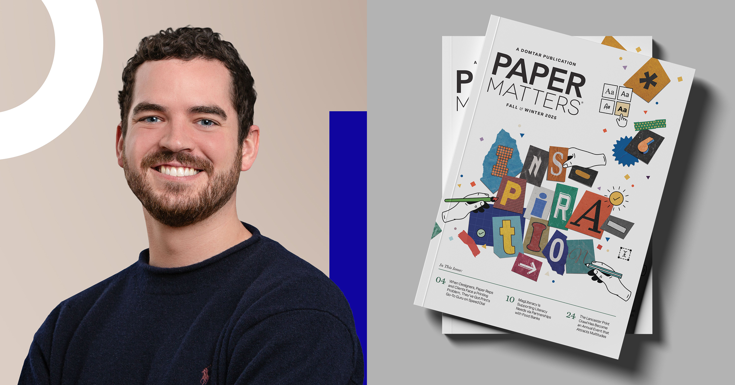
Paper Matters Q&A with Birdsong Gregory
Every turn of the page will remind you that inspiration doesn’t just happen by chance—it grows from curiosity, persistence and the courage to see things in a different light. In advance of the Paper Matters launch, we caught up with one of the creative minds behind the magazine about their approach to a project like this. Here’s what they had to say:
- Interviewer: Meredith Collins, Channel Marketing Manager, Domtar
- Interviewee: Josh Malchuk, Senior Designer, Birdsong Gregory
What was the biggest design challenge when designing this issue?
Not all content is accompanied by beautiful, well-lit, high-resolution photographs. It’s a fun challenge to find a way to incorporate images that are meaningful to the story but aren’t print-perfect. In some instances, a logo, icon or theme is the only starting point provided and exploring creative ways to incorporate stock photography or vector graphics that enhance the story and feel on-brand for the subject is an enjoyable exercise.
How did you decide on the visual hierarchy for the stories?
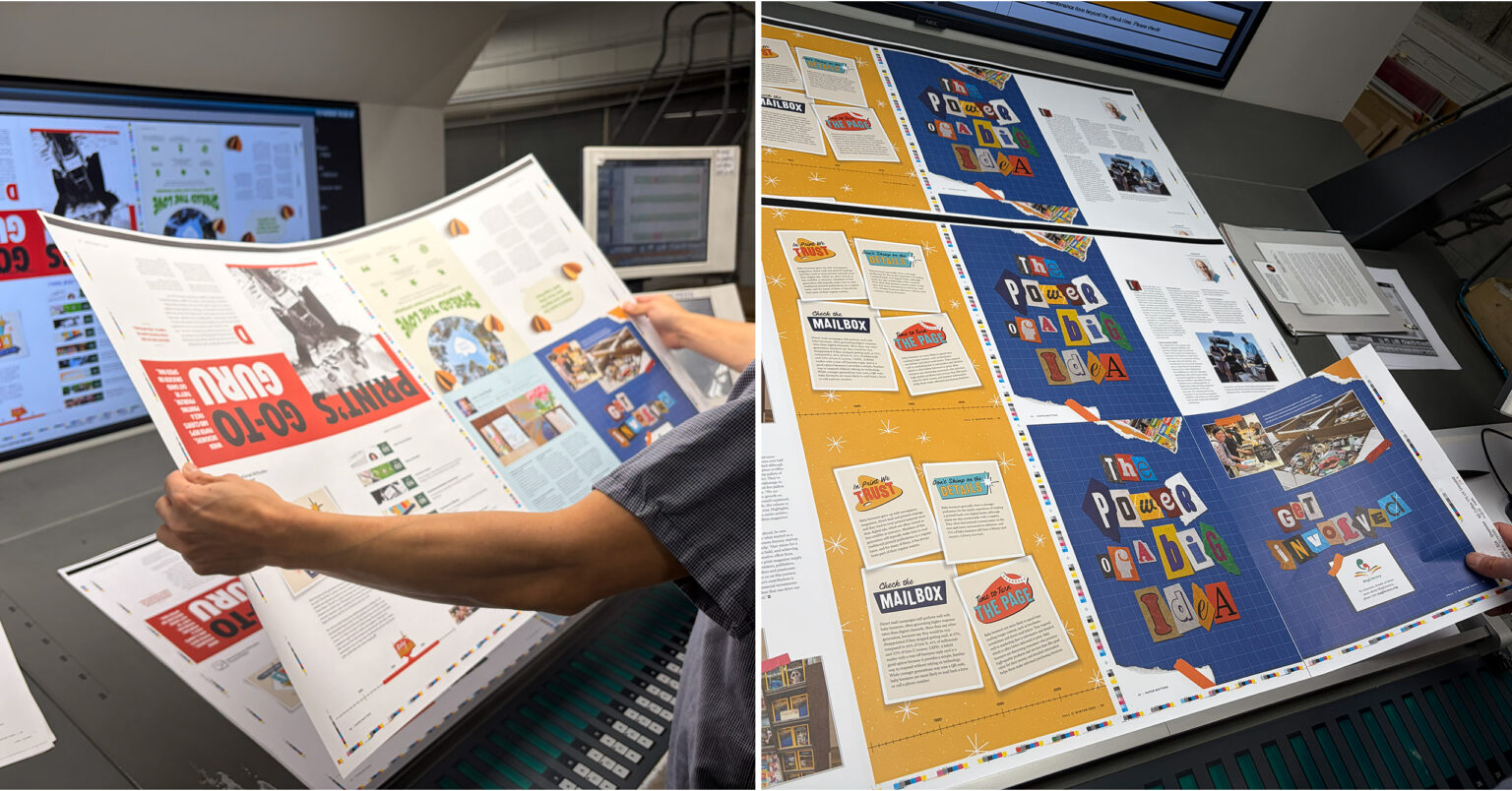
Consistent visual cues are used throughout the magazine with the goal of making the experience leisurely and predictable for the reader. Each story kicks off with a large headline treatment, an obvious indicator that a new article has begun. A visual identity is established for each story — if it carries over multiple spreads, the design language is consistent for easy reading and navigation. Some content comes with a rich library of supporting imagery integral to the story, like the article featuring the Lancaster Print Crawl. For those features, showcasing photography is a priority that is bumped up on the visual hierarchy and is afforded more real estate in the layout.
How do you ensure the magazine design itself looks inspiring, not just the content?
Fresh eyes are key; time away from staring at a layout often results in creative ways to spruce it up or rework it from a different angle. There are often 2-3 design options drafted for each article, which are then evaluated on how they appear on the page as well as in the context of the full magazine. Once all of the stories are in place, further refinements may be made (shifting color palettes, reorganizing the flow of articles, adjusting typography, etc.) to create a cohesive publication. Inspiring design starts with inspiring content, so it’s important to draw cues from the subject matter and use the layout to make it shine.
What’s your favorite detail in this issue that readers might overlook?
35 unique glyphs and letters were used to create the collaged, ransom-note-esque headlines throughout the issue. Out of the 35, only 2 were repeated — can you spot them?
Did any story in the magazine inspire a unique design treatment?
The content of each story inspires its layout and design in a variety of ways. Bold all-caps typography paired with a simple black, white and red color palette tied Print’s Go-To Guru to the riveting world of “Mad Men.” This was inspired both by the AMC gala invitation featured in the article and by David Drucker’s cool, confident, Draper-like attitude. As the Generational Attitudes Toward Paper series continues, each spread is graphically influenced by a design style popular in the era featured. Collaged letters are featured in our story about donated magazines; paper hearts and dimensional cutouts are visual aids for a story on loving paper and its sustainability; interviews with artists growing their businesses with print are presented in a format that resembles a resume or portfolio review. Finding ways to creatively present these stories by incorporating visual cues and context for the subject matter is all part of the fun.
How do you balance creativity with readability in a print format?
Legibility and intuitive flow are the main priorities when designing a print layout. Design starts by dropping in the copy and then organizing the columns of text in a comfortable, readable format (keeping an eye out for awkward paragraph or page breaks, grouping blocks of copy so the reader doesn’t need to jump around the page, etc.). Then graphics, illustration, and images are brought in as visual support. Featuring three interviews in one article could pose a readability challenge, but with its creative presentation the Growing a Design Business with Print story showcases each interviewed artist in a distinct, concise and digestible format.
Our hope is that the effort put into the magazine will reflect the inspiration you take from within its pages. Each story has the power to spur someone to edream a little bigger, think a little bolder, and to create work that leaves a lasting impression—and if you don’t believe us, just flip through Birdsong Gregory’s Work. Subscribe to Paper Matters magazine today.